Deforestation Data Visualization
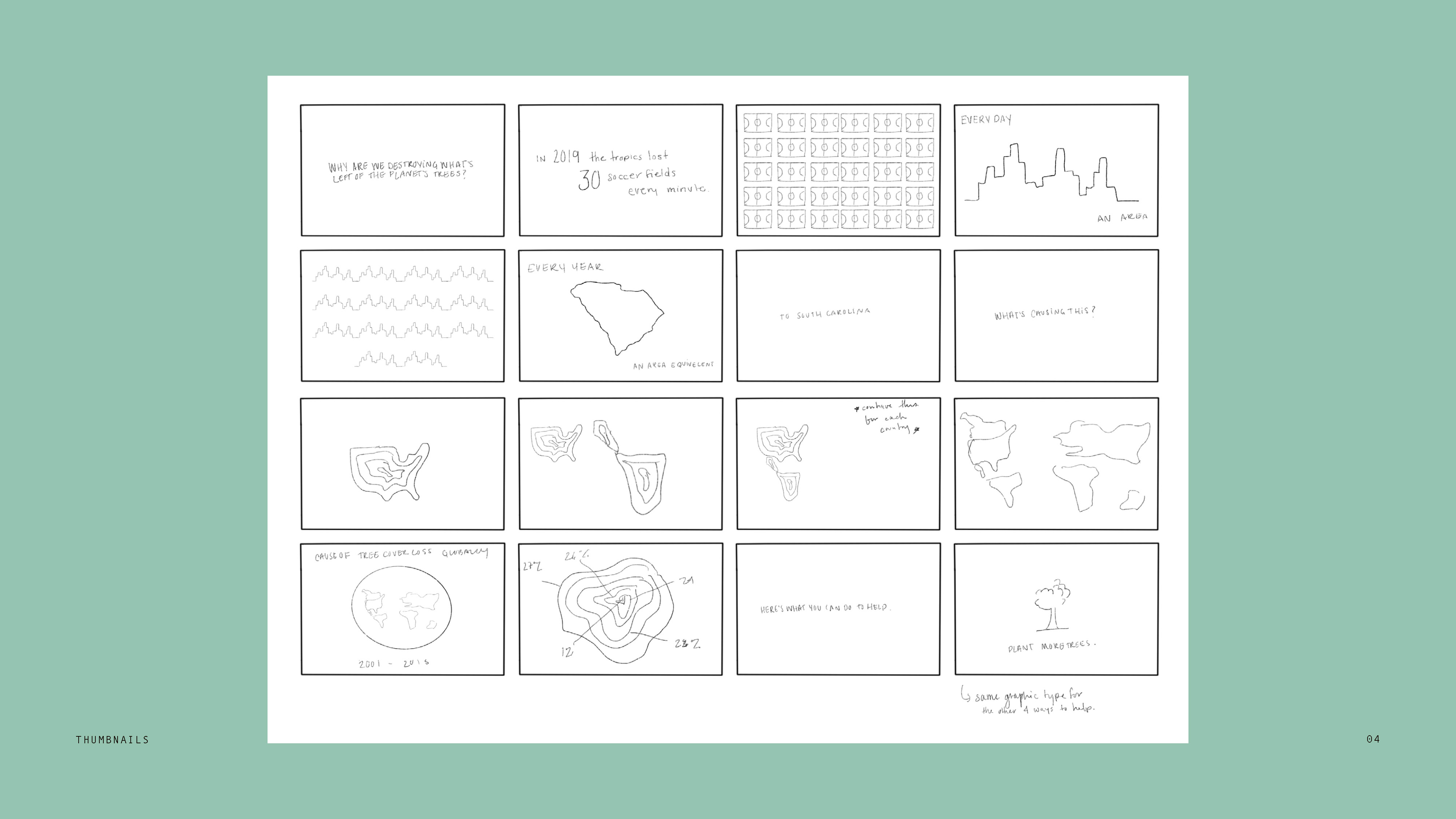
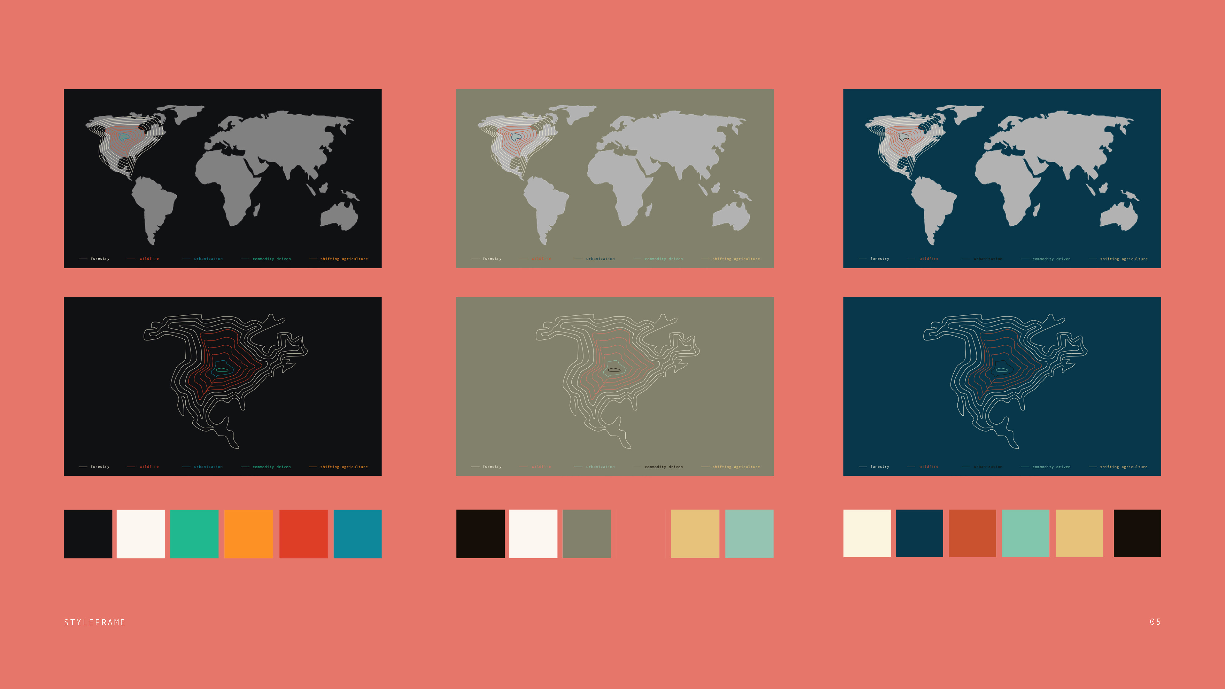
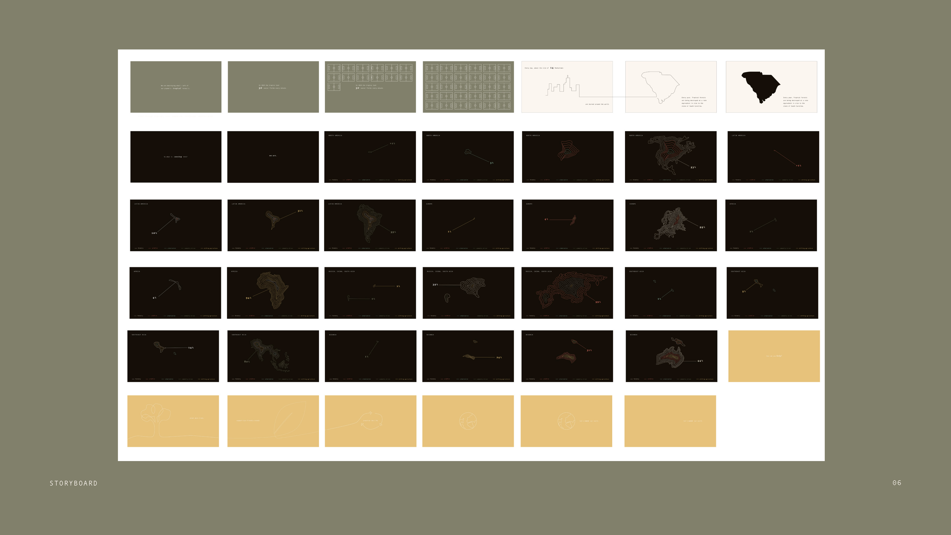
Displayiing data through an old computur style to communicat the percentage of each cause of deforestation in each country by using tree rings and line work to represent those percentages.
During the process of creating the data visualization I ran into many problems that I had to over come including pacing and leaving things on the screen long enough for people to read but not get bored. One of the main ones was too much repetition between the countries. To solve this problem I added more information about deforestation in between the countries by using pop up windows. I chose to use the style of pop up windows to relate back to old computer errors.
All aspects of this project were created by me.